What's inside
1. Introduction
Welcome to the all-new Newsletter Composer! Through this guide, we would like to offer an overview of the new features available within the Visual Composer and help our previous users migrating from the old editor. Please read on carefully and if still in doubt don’t be afraid to contact us through our forums or social accounts.
2. Starting the editor
Starting from the main Newsletter Dashboard, click on the “Newsletters” and then on “Create Newsletter”. This will take you to the new composer, which is now the default newsletter creation tool. If you still want to use the old editor, you will be offered an option to do so on the following screen: this is particularly useful if you have created your custom themes, as they will show up exactly like they always did. However, please note that once a tool is selected you will be able to edit that newsletter only with that tool: composer-created newsletters cannot be edited with the old editor and vice-versa.
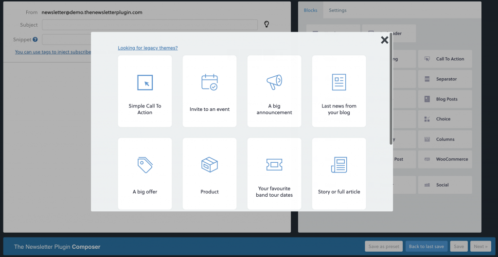
When you click on “Create Newsletter”, you will find our presets. Click here to know more about them.

3. The working space
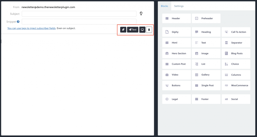
After selecting the preset, you will move to the working space. The main working space is divided into two sections: the newsletter area and the blocks sidebar.
Newsletter Area
In the main newsletter area, you will see your newsletter, simply drag and drop the blocks you want to include! Starting from the upper section, a standard newsletter is commonly made of a header, a body and a footer. The body area, in turn, may contain a text paragraph, a hero image, a call to action and so on. This is basically what you will see the first time you open the composer.
You can notice the header, with the logo and a service text, the body, with a hero image, a paragraph and a call to action, and a footer, with contact information and some “legal” text at the very end.
Sidebar Area
On the right, you can see the sidebar area with all the blocks. They’re grouped by functions: Header, Content, Footer, based on which section of the newsletter they are commonly related to.
4. Composer settings
in you click on “Settings”, at the top right corner of the composer, you can change the global styles of your newsletter. You can chaing the main background color, the blocks color, fonts and button styles.
5. Adding a block
To add a block from the sidebar to your layout just click and drag it from the right area to the left, then release it in the desired position. If you feel a block is not where you would like it to be, you can always move it up or down just dragging and dropping it on the new position.
6. Removing a block
To remove a block from the layout, just hover on the blocks in the newsletter area and two icons will appear on the right. Clicking on the x icon will remove that block from the layout. You can repeat this step until you have a blank layout and then start over by dragging your preferred blocks.
7. Editing a block
Our composer lets you edit the block and its content as well. Content-level customizations will always overrule block-level customizations. Keep this in mind when setting global font families, for example.
Block Options
If you click on the pencil icon, a modal box with some layout options will come up. All the options set in this box will affect every item of that block: e.g., if you set a specific font family using this option, all the text blocks inside that block will use that font family. This lets you specify some general styling across the different parts of your newsletter. The same applies to the background color. We will take a more in-depth view of all these options in the 10. Editing the blocks section of this guide.
Content Options
Every block will have some specific elements that can be edited: e.g. the image block will let specify the image source and link, the header block will let you upload your custom logo and some introductory text. This edit box differs from element to element but they are all quite self-explanatory: the Edit Text box will let you edit your paragraph…and so on. We will take a more in-depth view of all these options in the 9. Editing the content section of this guide.
8. The blocks
Every block you will find on the right adds specific content to your newsletter: they should be used to customize the look and feel of your mail according to the goal it must achieve. Every block is made of one or more elements and they all have some special options you can tweak: e.g. clicking on the image edit icon inside the image block (just hover on it and the pencil icon will come up) will let you change the image source and its link.
Here’s a list of the blocks you can add to the newsletter with a basic explanation of their function and editing options. We will periodically add new blocks in the future, so stay updated and subscribe to our mailing list. Here you can find the list of our premium blocks, available with a paid subscription plan.
Header
Ideally the beginning of every newsletter, with a custom logo area and some text.
Hero
A big centred image, a strong text heading, a paragraph, and a call to action button.
Heading
A big paragraph title you can use to start a paragraph or a new section
Text
A simple, editable text block.
Call To Action
A call to action (CTA) is an invite to your readers to make them act: something like “Read more..”, “Buy now” or “Fill the form”.
Image
A full-width image: this could be a banner, an image of your products, even an animated gif!
Blog Posts
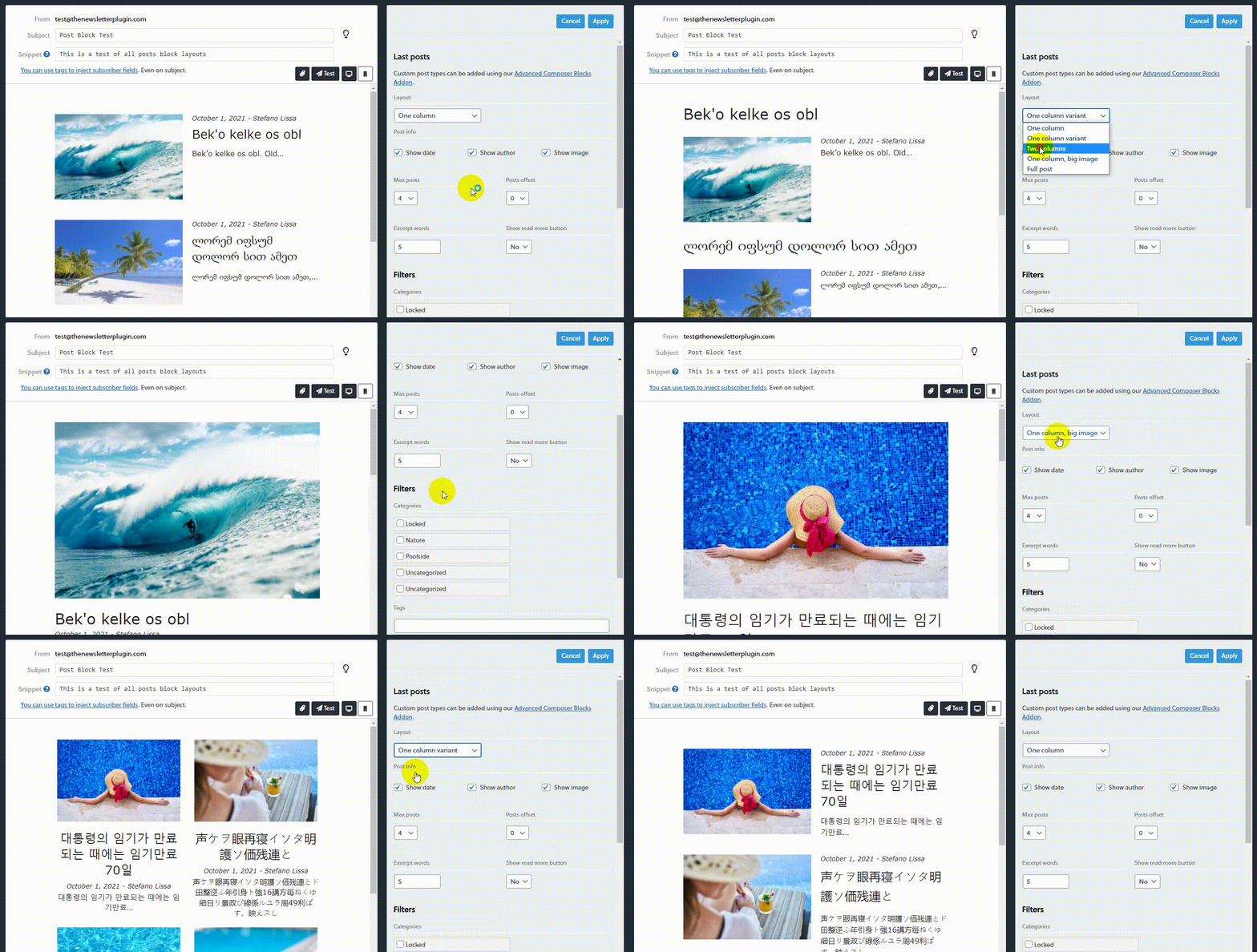
These blocks will import the latest posts from your blog and show them in a single column with a thumbnail picture, post date, a title, and a link to the article.

Footer
A centred text block to show your contact information and/or a disclaimer.
Legal Text
A centred text block to show an Unsubscribe and a View this email in your browser links. These are both required by the CAN-SPAM Act.
Social
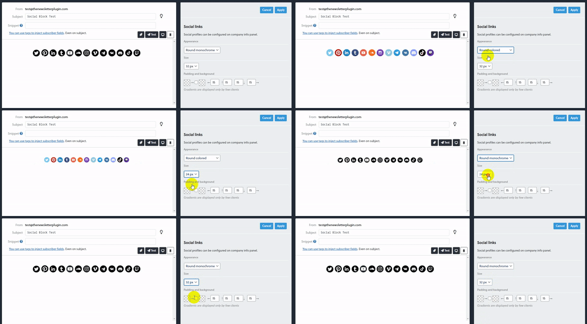
This block will show social networks icons that link to your social profiles. To configure your social profiles, please go to Company Info > Social panel under the Settings section of the plugin.

9. Editing the content
When editing the content, you may find different editing boxes. Let’s see them one by one.
Edit Text
This is a quite common text editor that lets you select font family, font sizes, font styles (bold, italic and underlined), you can set up a hyperlink, create some ordered list, insert an emoticon, align text. We’ve added a button with our icon that you can use to easily insert our shortcodes into any paragraph.
Edit Image
This is a simple edit box that lets you specify the image source and set a link for that image. You can insert an URL or use the WordPress media uploader. The image will be automatically centred.
Please note: we use stock images courtesy of Unsplash.com as placeholders.
Edit Title
With this edit box, you can set the title itself and its colour.
Edit Button
With this edit box, you can style your button look. You can set the button label, link, text color and button background.
10. Editing the blocks
When editing blocks, you will find two different editing boxes: one for blocks with blog posts and one for all the other blocks. Let’s see them:
Edit Block (Blog Posts)
With this edit box, you can set how the blog posts should appear in this block. You can set a background color, font family, how many posts you would like to show, which category they should belong to and which tags.
Edit Block (All other blocks)
With this edit box, you can set the main font family and background color for the related block. Please note that this will have no effect if you set a different font family on one of the inner elements of a block.
11. Preview your newsletter and send a test
When you feel your newsletter is ready to be sent, remember to hit the save button. At this point, it’s time to check how it will be displayed when it arrives to its destination. There are two ways to check it: the first, it to click on the mobile or PC icon in the newsletter area (see screenshot below), while the second is to click on next and go on the “preview” tab.

Important! While the rendered preview of your newsletter is very useful for testing layout issues, please note that some of the links may not work. This happens because some links are generated only when a real delivery is triggered.
Send a test
Once you are done with the newsletter, it’s a good practice to send to yourself a test. This is important to see if there are any layout issues and if the links and buttons you inserted are working correctly. By clicking on “test” you can either insert an email address or sending it to your test subscribers. Read more about test subscribers here.
Subject and snippet
The subject is of course the “title” of your email, the first thing your subscribers see when you send them a message. As you may already know, the subject is what triggers your readers to open or skip your emails, so it is very important to write an engaging subject and give yourself enough time to find out which could be the best subject.
You can ask yourself: what about if I receive an email with that subject? Would I open it or not?
The snippet is a hidden part of the email text which is shown by some email clients, like Gmail. If not present, Gmail will extract the first words of your message to create a snippet. See an example in the picture below:

The snippet is particularly important if the first line of your email has generic links, like “view online”, or generic text like the title of your site which could not be so relevant to your subscribers.
Common issues
Images are not shown
- Check on the Help/System panel for warnings about the images/upload folder: sometimes it is configured to be “relative” and that is not compatible with emails
- If the email reader asks to press a button to unlock the images, it is a problem of the email client set for privacy or not trusting the sender: that is not something that can be controlled by the plugin
- If images are not shown on iPhone or Apple devices, read more here: the provider intervention is required.
Emails look bad on Outlook, Gmail, …
Usually, emails created with our composer should look good on all email clients BUT the rendering is not always the same. Outlook, for example, does not support some kinds of formatting.
If you created the newsletter using the free editor or HTML, be aware that you should use very simple layouts otherwise they won’t be respected by email clients (even if while editing they look good).
Do not “copy and paste” from Word or other editors: the generated code is almost always not good for email readers.
